Right Quick Roasters
Brand Strategy
Modern Logo Design
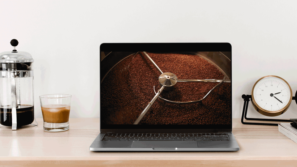
Website Design
Packaging
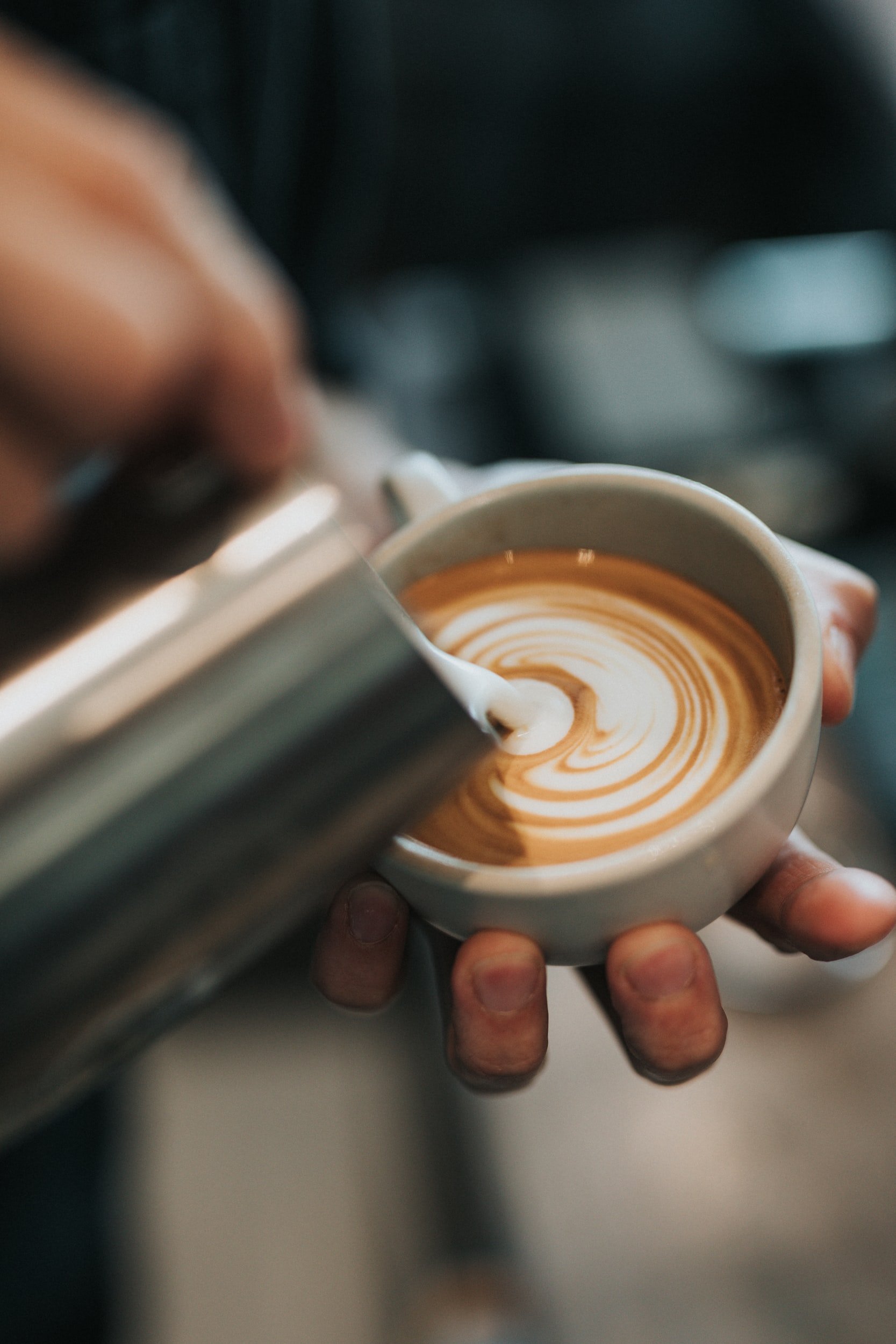
Nothing quite rivals our obsession with a great shot of espresso, so when longtime coffee professional Chris Owens approached us for branding support on his newest coffee roasting venture, it definitely perked our ears. Once he shared that the brand would empower women coffee producers and small businesses in Guatemala, Mexico, and Colombia, our answer was an enthusiastic yes.
With a charming, southern-inspired name, Right Quick Roasters needed to feel distinct, approachable, and warm. We also aimed to visually communicate the global community behind every cup—from farm to café.
Through brand discovery and strategy, we landed on a playful, artistic aesthetic with warm, friendly colors and hand-drawn illustrations. After exploring several logo concepts, we developed a custom monogram that merged the R and Q—designed with the foot of the R stepping forward as a subtle nod to the brand’s mission to move coffee culture forward.
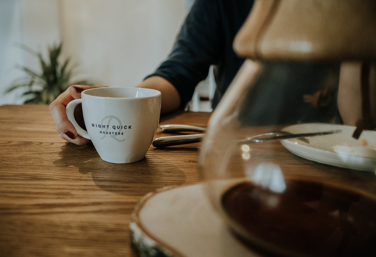
The logo emblem features two inner circles—symbolizing the rim of a coffee mug and saucer, a creative tribute to the expansive, interconnected community that stands behind each drop of espresso.
To complete the project, we designed minimal, flexible coffee packaging and a Squarespace website optimized for storytelling, product education, and eCommerce, giving Right Quick Roasters a polished and approachable digital presence.